Keybase
Making a technical app accessible

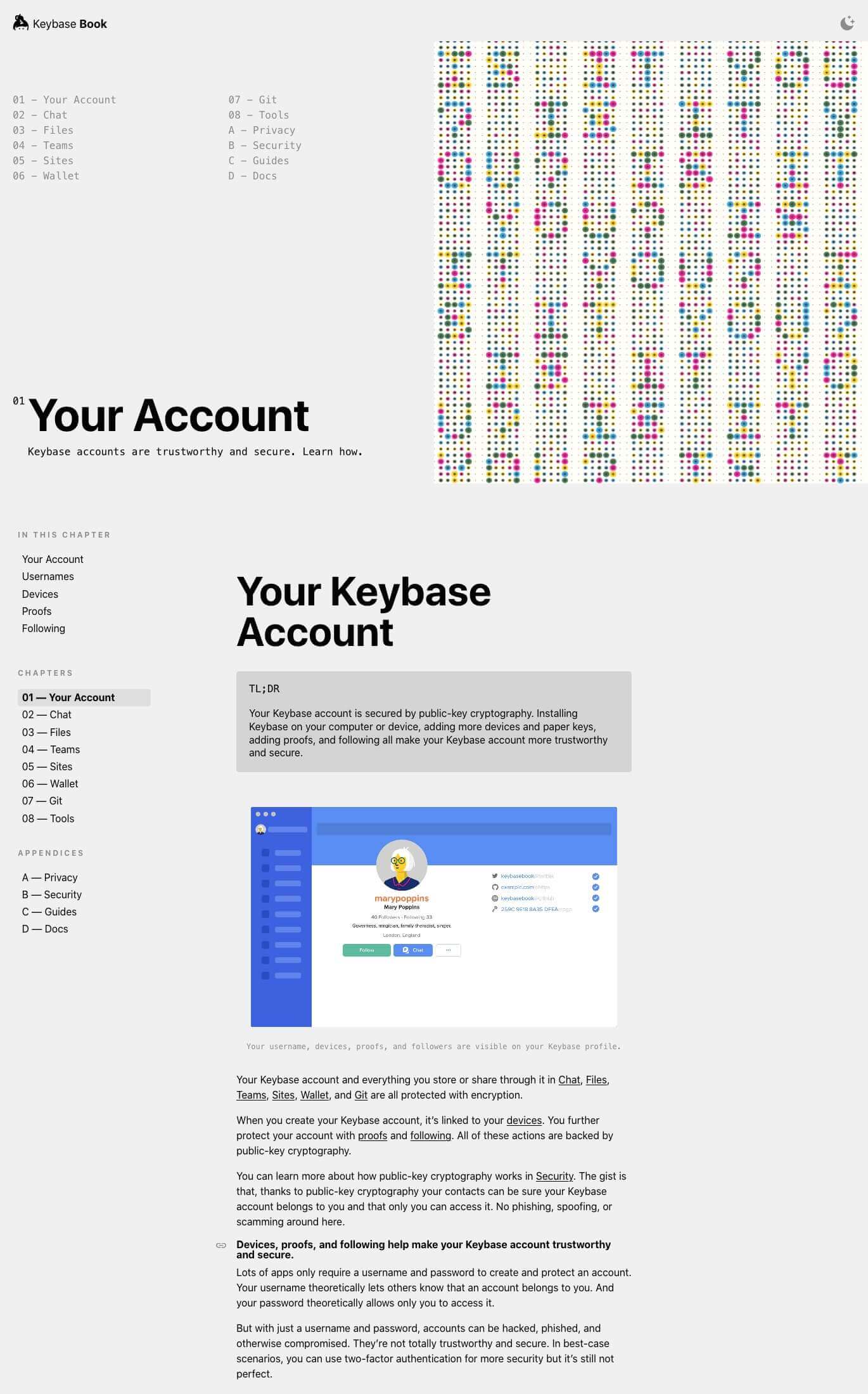
FIG 1. Keybase Book homepage.
Faculty helped us identify and address a big opportunity to better serve our customers. They provided clarity, expertise, and outstanding outcomes.Chris Coyne, Cofounder of Keybase
Keybase is a secure, end-to-end encrypted app for everything you do online. Everyone should use it—for chat messaging, file sharing, team collaboration, and more—but not everyone does.
The public-key cryptography that powers Keybase makes the app work a little differently than other apps. Not understanding why and how was preventing more people from understanding the value of Keybase, which was ultimately preventing them from using it.
Keybase’s team knew this was a problem. And they knew they needed to work with a team that understood both the technical details and the needs of non-technical users to better show folks what Keybase is all about. They trusted Faculty to design and build a brand-new documentation site—and write new documentation—to help make Keybase accessible to more people. And so, Keybase Book was born.
The work
Since the beginning of the company in 2014, the Keybase team had been creating their own documentation—both a technical manual for advanced users, and blog posts intended for a wider audience. While much of it was engaging, it was really only useful for more technical users. And because the content lived in multiple places, it wasn’t easy for people to find answers to their questions.
Our goal was to succinctly and concretely explain the uses and benefits of Keybase on one beautiful, responsive, easy-to-navigate, and fast site. It was also important to the Keybase team that we make it, like Keybase itself, open source. Fortunately, Faculty is a small but mighty team with the skills to cover the content, design, and development.
The results
Keybase Book is a comprehensive guide for anyone using the app. It helps people understand why Keybase works the way it does—proactively addressing common questions, concerns, and misconceptions—so that everyone feels safe and smart using it. It reflects the spirit of Keybase: intelligent and fun. And it supports Keybase’s long-term goals: the site is fast, easy to use and update, and affordable to maintain.
Faculty’s talent and care for their work delivered excellent results on all aspects of our project—from content creation to user experience design and web development.Chris Coyne, Cofounder of Keybase
Information that’s accessible to everyone
To write and organize useful and usable documentation, we established a mission for our content: to help Keybase gain more users by sharing information about how it works and why it’s so powerful for:
- Non-technical folks who rely on the internet to get things done and are concerned about security and privacy, and
- Technical early adopters who understand public-key cryptography but may not understand how easy Keybase makes it for everyone.
Further, Keybase Book should show how Keybase can be used for all of your tasks online, with all of the people you interact with, easily and more safely and securely than anywhere else.
Everything we put in Keybase Book had to support this mission. This helped us create some other guidelines. For example: if we introduced a technical term, we had to define it. We only shared technical details if they were necessary. When we had to present more complex info, we broke it down into short sentences and lists. Following these guidelines helped ensure that what we wrote would be clear and useful to a broad range of non-technical and technical users.
While all of our work was informed by the feedback and user data we had, our hope is that Keybase Book will continue to respond to user needs and become even more useful over time. Because Keybase Book is open source, anyone can contribute new writing, questions, or ideas to help clarify information.
Remembering the content mission and guidelines will help keep new additions useful. But for now, beginning with clear, accessible information makes it easier for everyone—non-technical and technical folks alike—to understand and use Keybase.
Diagrams to clarify key concepts
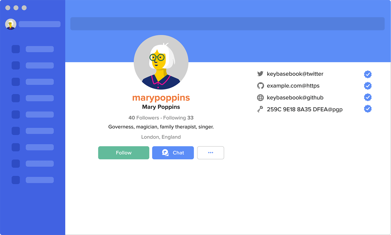
Some of the concepts of Keybase are a little different than other apps—for example, passwords aren’t necessary—so we created custom diagrams to help ensure key concepts were as clear as possible.
Diagrams also make the content more scannable and contribute to a gentle pace by breaking it up into smaller sections.

Screenshots were considered, but they would need updating as the UI evolves, and the extra detail would add to the reader’s cognitive load.
To strike the perfect balance, our custom diagrams are based heavily on the existing UI, but unrelated parts of the UI are intentionally abstract or low fidelity. This helps keep the focus on what’s being explained.
A playful and easy-to-use website
With a solid foundation of content, we started with a simple, content-focused design that prioritized navigation and readability.
It was a big departure from Keybase’s previous documentation, but it also looked like a lot of other help and documentation websites. This isn’t necessarily a bad thing. Often, patterns emerge in web design because standardization can be useful—in part, because it’s what people are (or at least become) used to. But we saw an opportunity to maintain usefulness while making Keybase Book a little more engaging.
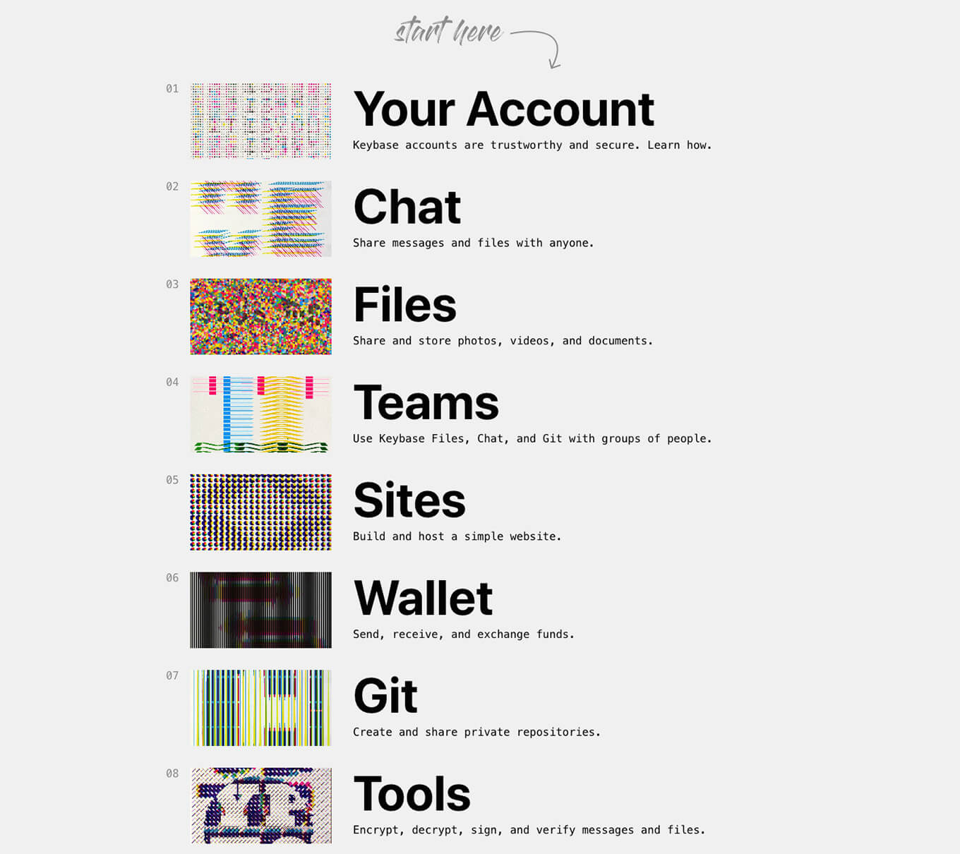
We reached out to our friend and designer Kelli Anderson. We knew she’d be able to think creatively about our approach and bring new ideas to help shape the art direction. Working with her, we kept the editorial spirit of Keybase Book—a tidy sidebar navigation, monochromatic scheme, and clean space for reading—and added a more dynamic landing page and colorful illustrations.

Fast and fun illustrations
As the design and the illustrations became more complex and interactive, we wanted to maintain usefulness and usability. Everything on the website still had to be responsive, accessible, scalable, and fast. (This is always important in our work.) No matter how complicated the illustrations were, everyone—regardless of the device or browser they’re using—should get a good experience.
To accomplish this, we used JavaScript and CSS, but avoided frameworks which require upkeep and are often encumbered with unnecessary overhead. Keeping our code as simple as possible helps ensure that what we build works for the long-term, as new technologies are adopted, as well as for older browsers and on slower internet connections. (We always strive to adhere to progressive enhancement .)
After we brought the illustrations to life, we made them fast. To maximize the frame rate, we applied three principles:
- Reduce the work of rendering each frame
- Pre-render any parts of the frame that can be reused
- Use hardware acceleration as much as possible
The biggest improvement came from minimizing changes to the browser’s drawing context. As an example, if the goal is to draw nine shapes in three different colors, it is much faster to group drawing operations by color than position, so we modified our technique to draw all shapes of the same color before moving to the next.

Pre-rendering required that we strike the right balance between speed and memory use. To avoid redrawing a shape such as a red triangle, we could draw it once and save that drawing in memory for later. Copying an existing drawing is significantly faster than doing the math to make a new one, but it comes at the cost of memory. We worked to find a good balance between performance and memory usage whenever possible in the animations. Once the reader goes to the next chapter, or closes the tab, all of that memory is freed up, ready for the next task.
We also relied on the technology in the computer’s hardware instead of in the browser. This temporarily takes up a little bit more memory but makes the interactions significantly faster. As a result, the illustrations animate 60 times per second, on most browsers. They appear as smooth and fluid as video, but they’re also interactive.
The illustrations also meet accessibility preferences for reduced motion. Another benefit of our relentless focus on doing things right is that we can design and build all kinds of fancy features without hindering accessibility.
An affordable, custom, cloud-based platform
At Faculty, we can build new websites and apps that meet the specific needs of our clients without starting from scratch—saving everyone time and money. Over the years, we’ve built a simple, solid platform that we can fully customize. Our platform relies on tools that are widely used so anyone can build on top of it, but ideally clients won’t have to. We can modify it according to your exact needs and specifications.
Because a big goal for Keybase was to make Keybase Book open source, we had to make it easy for anyone to contribute to it. To do so, we used a combination of GitHub and Markdown, both of which many people already use. GitHub is a web-based platform with a relatively simple interface. Markdown is probably the easiest markup language for formatting text. Our platform supports both. Using tools and technologies that are widely adopted makes the websites we build easier to adapt for a broad range of uses and users. This benefits Keybase, and of course, anyone else we (or they!) work with.
But meeting Keybase’s initial requirements was just the beginning. We also ensured that Keybase Book would be super fast and affordable to maintain. Pages load quickly on everything we make because our platform is built on best practices. We version assets—like images—which lets us cache them very aggressively, and we rely on CDNs—content delivery networks—to distribute those assets close to users. The result is that the websites we build are super fast by default.
We generally deploy apps on our platform to Amazon Web Services (AWS). AWS supports modern development practices and is significantly cheaper than using a more traditional platform such as a hosted content management system (CMS). A custom, enterprise-level CMS can cost $300/month or more. Using AWS for a site like Keybase Book costs about $10/month. The expense of using our platform over time is minimal. And because we’ve been using AWS for a while, we’ve already built solutions to proactively address common issues. As a result, Keybase will be able to rely on Keybase Book for the long term. And Keybase Book readers will continue to benefit from a website that provides clear, useful information and rewards repeat visits with a faster and faster experience.
Faculty quickly understood the complex technology that powers Keybase, as well as how to better meet the needs of our non-technical customers and help them understand, appreciate, and use our product.Chris Coyne, Cofounder of Keybase
Thank yous
We’re grateful to everyone we worked with on this project: the whole team at Faculty, Kelli Anderson, and especially everyone at Keybase. Thanks for trusting us to do good work.
Since Keybase has been acquired by Zoom (shortly after we completed this project), we know both Keybase and Zoom will only continue to get better for everyone who uses them.
Contact
Faculty is a friendly, experienced team here to help you with digital strategy, design, and development. We’d love to hear about your project.
Send us a message and let us know how we can help.